

Product Information
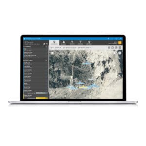
Eagle.io is an innovative cloud-based data visualization software. With its feature rich functionality,you can import, configure, manage and share your data securely from anywhere. When logged in, it provides you and your team with real-time access to the data presented in charts, tables, dashboards and over maps. When logged off, it continues to check the data and will send alerts by email and SMS when preset alarm thresholds are exceeded.
For the day-to-day needs of most projects, the above functionality is sufficient. However, from time to time, further analysis or enhanced presentation of the data may be required. This is where Specto Datalake comes in.
Specto Datalake
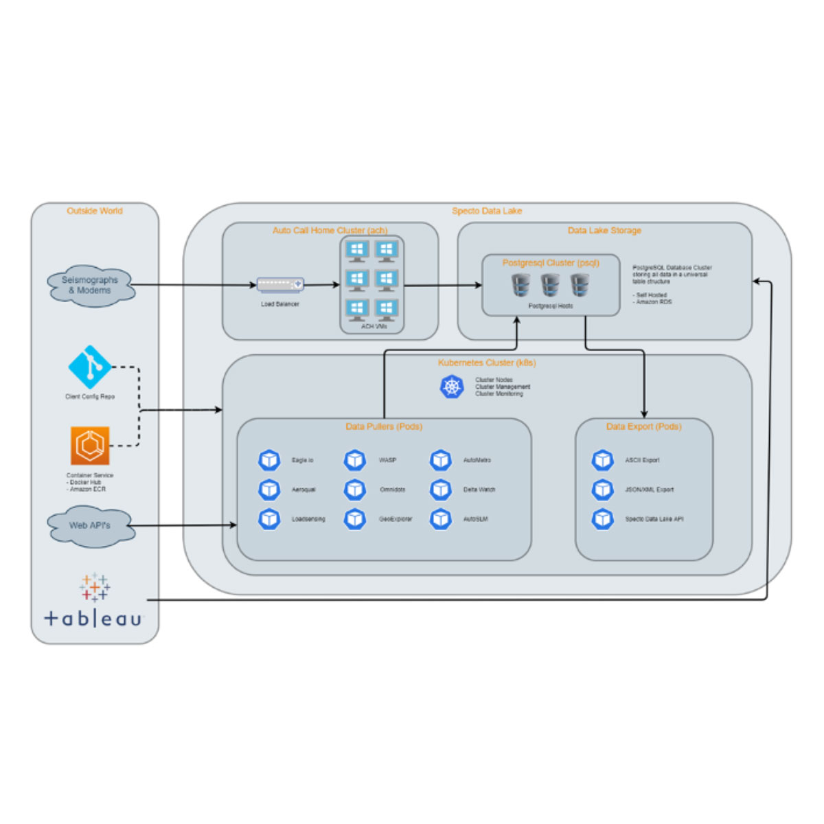
Specto Datalake is a collection of PostgreSQL databases that reside in the Relational Database Services (RDS) of Amazon Web Services (AWS). Each database contains the tree structure and data of nodes which are pulled from eagle.io and kept synced using the eagle.io HTTP API running in “containers” orchestrated by “Kubernetes” on our secured servers.
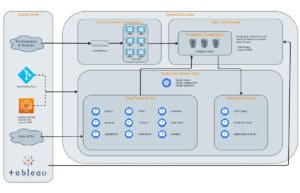
The Specto Datalake makes the data in eagle.io available in an alternate database format, rather than the original databases, from eagle.io, which is not open to the users for further analysis.
Data Analytics Tools
Data in the Specto Datalake can be loaded, processed and viewed by a variety of analytic software tools. Our preferred tool is Tableau, a visual analytics platform that is transforming the way people use data to solve problems by helping them to see and understand data.
Below are three use cases of Specto Datalake using Tableau:
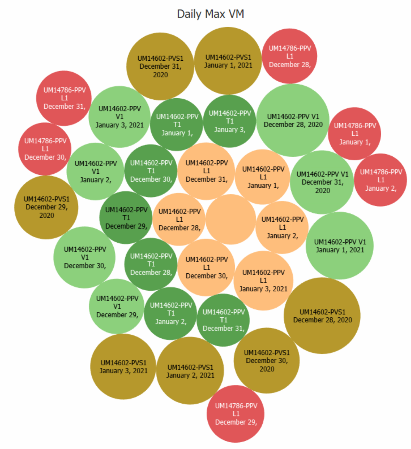
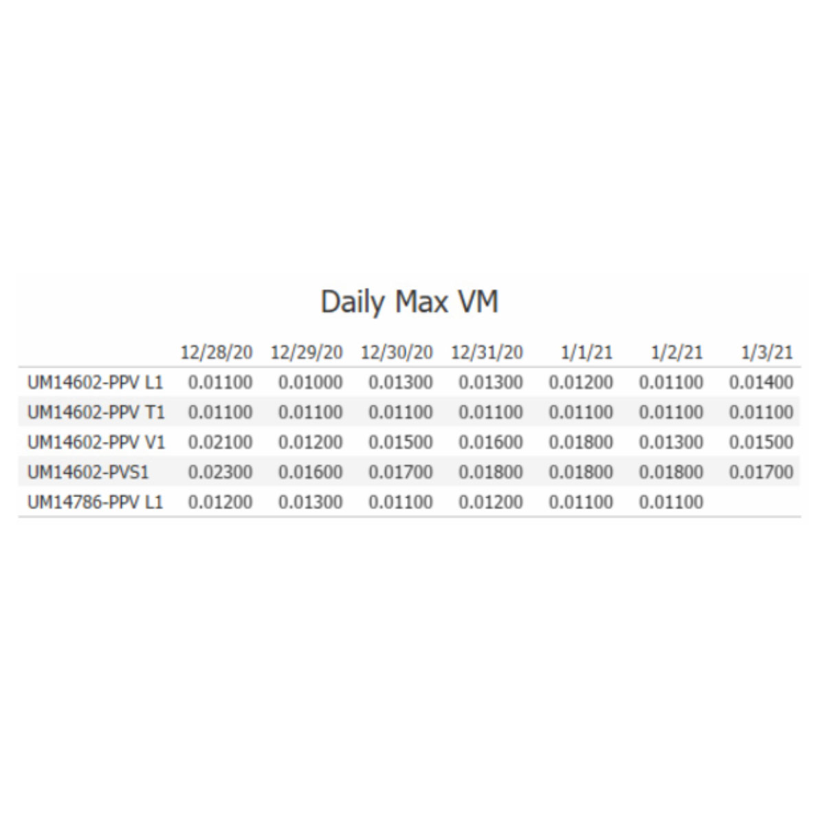
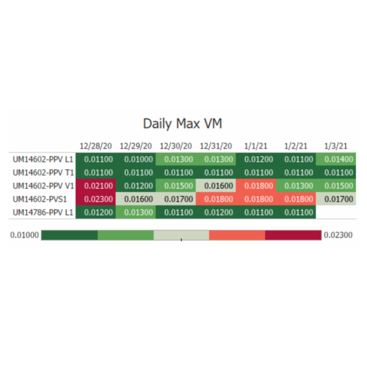
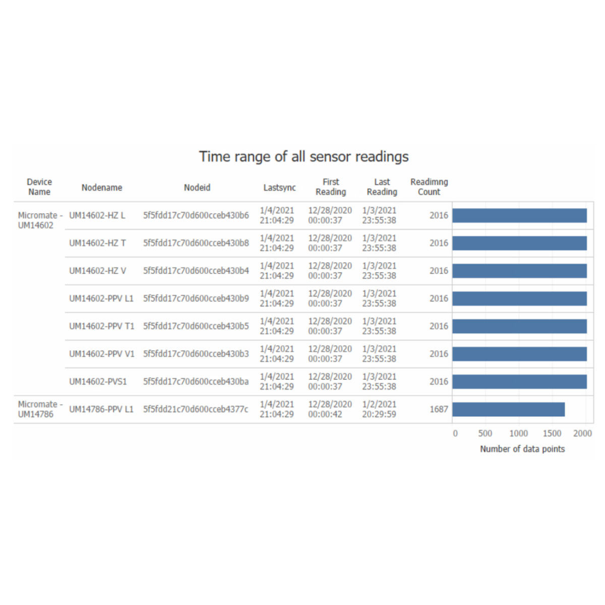
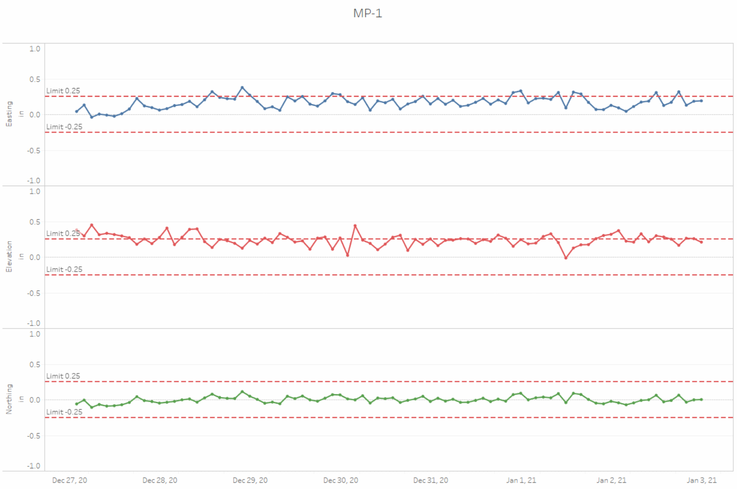
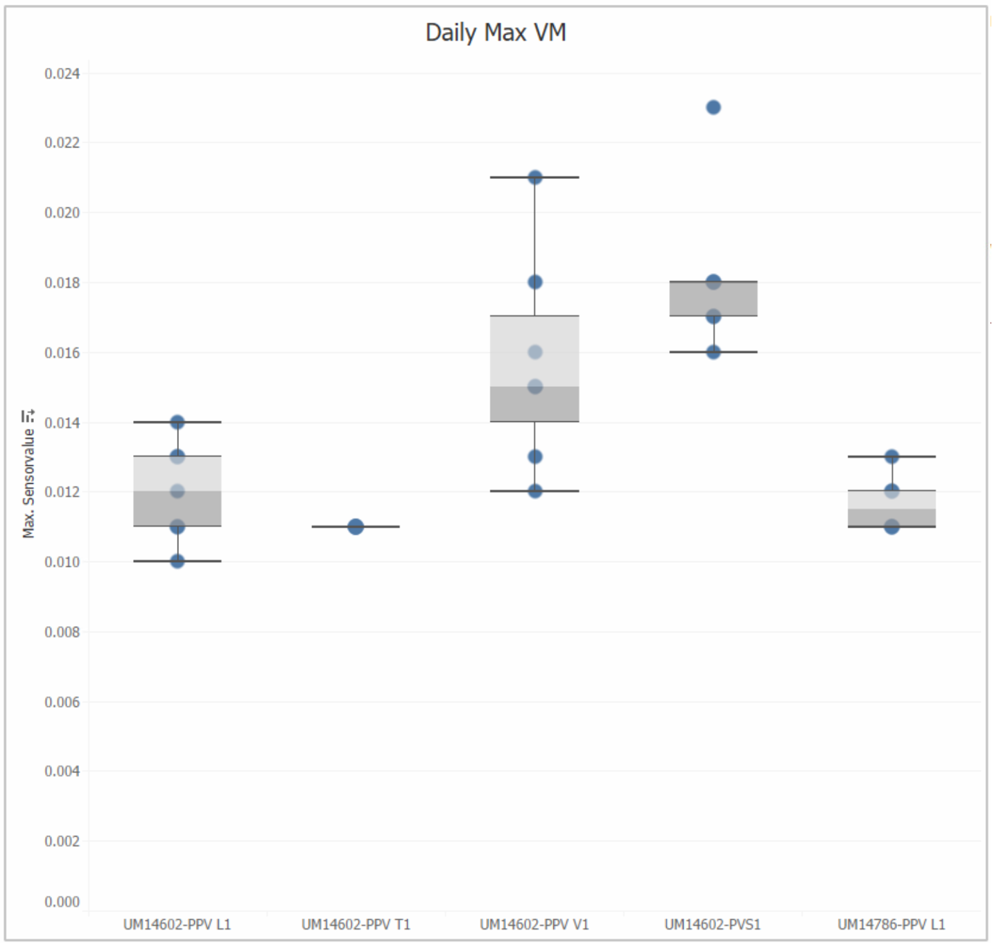
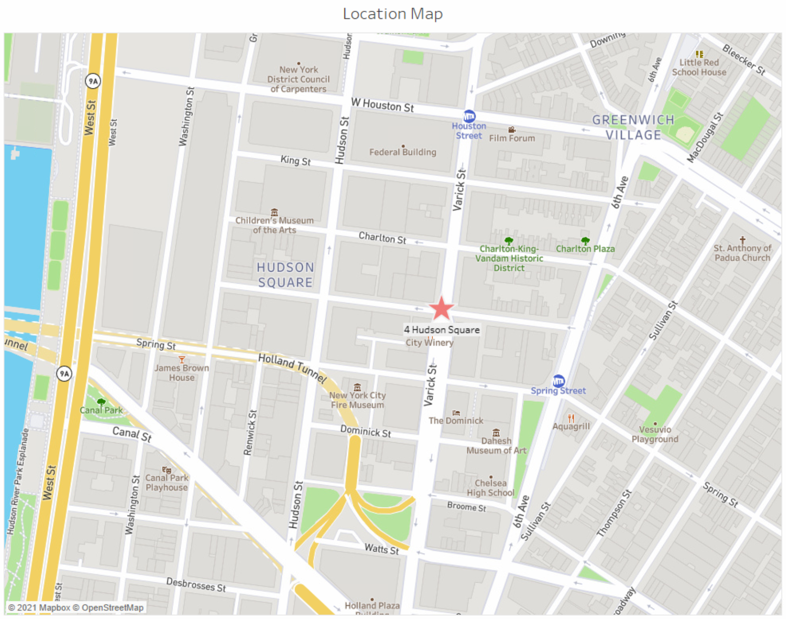
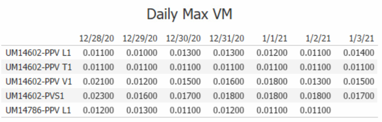
Charts, Maps and Tables
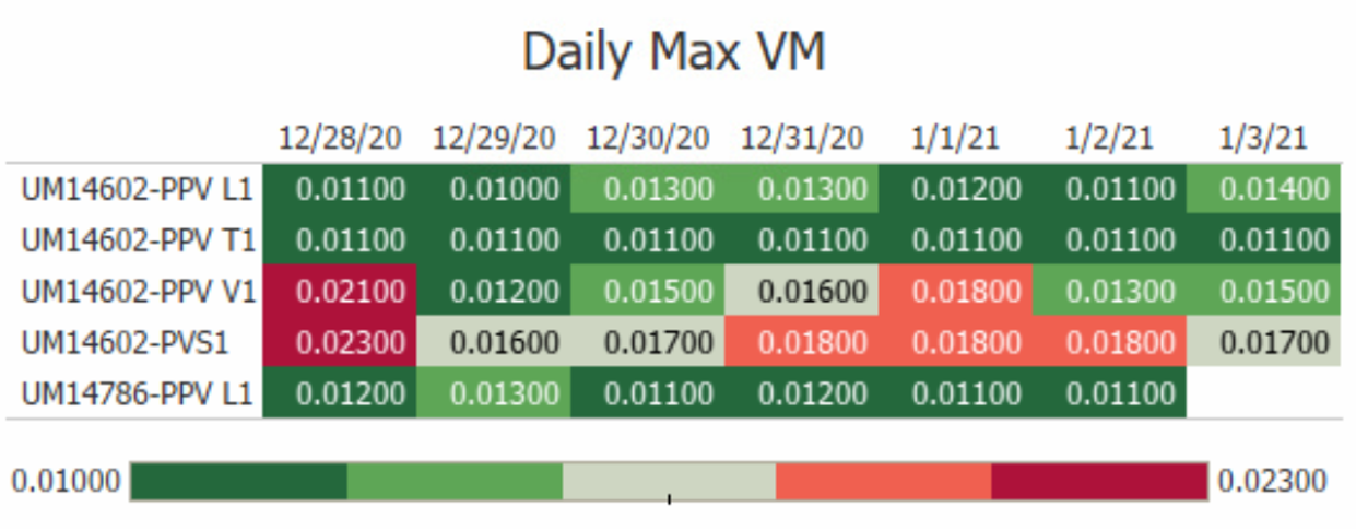
- Professional looking charts, maps and tables of data in eagle.io can be created quickly with only a few clicks.
- Data can be aggregated (sum, average, min, max, medium, etc.) easily.
- In addition to the standard chart types of lines, bars, pies and scatter plots, it also includes heat map, histogram, box-and-whisker plots, Gantt, bullet graphs and packed bubbles.
- Default background maps are based on the OpenStreetMap, with map and data layers as well as the options to import custom images and Geocoding.
- Table and tables with data highlighted are one click away
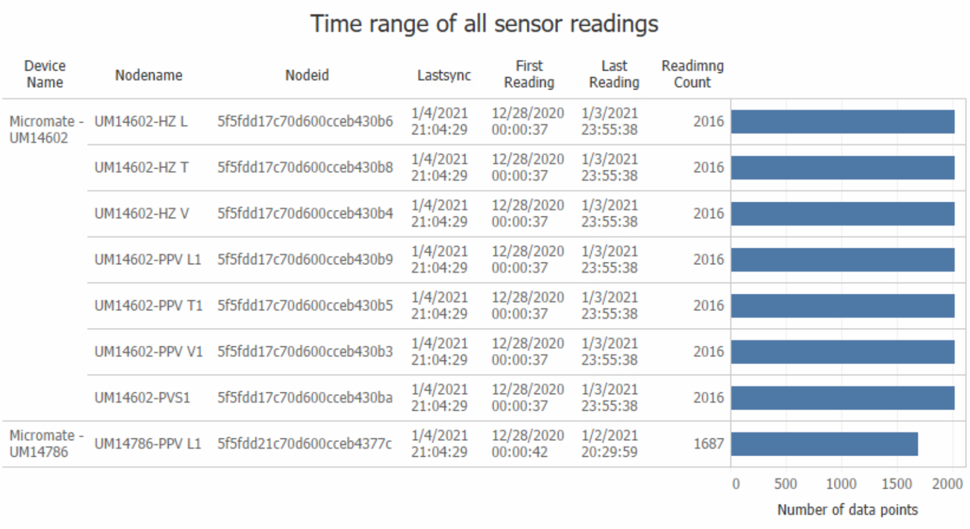
- Table to include statistic of parameters such as time range and the number of data points that can be easily generated
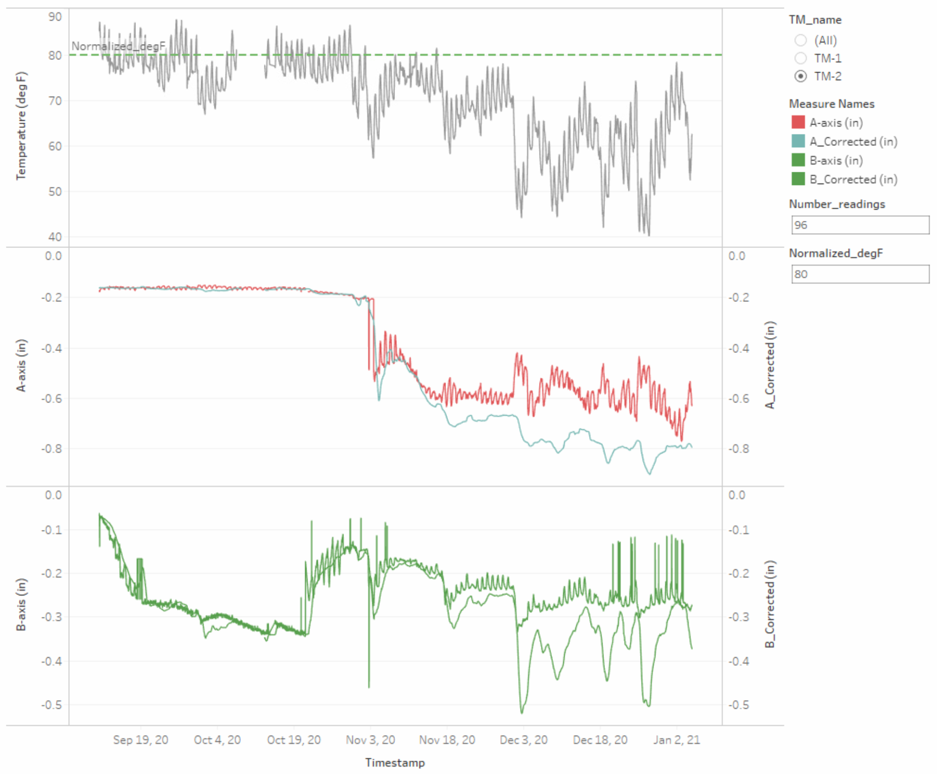
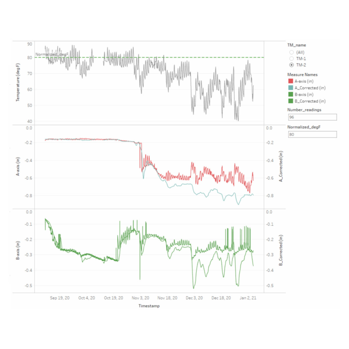
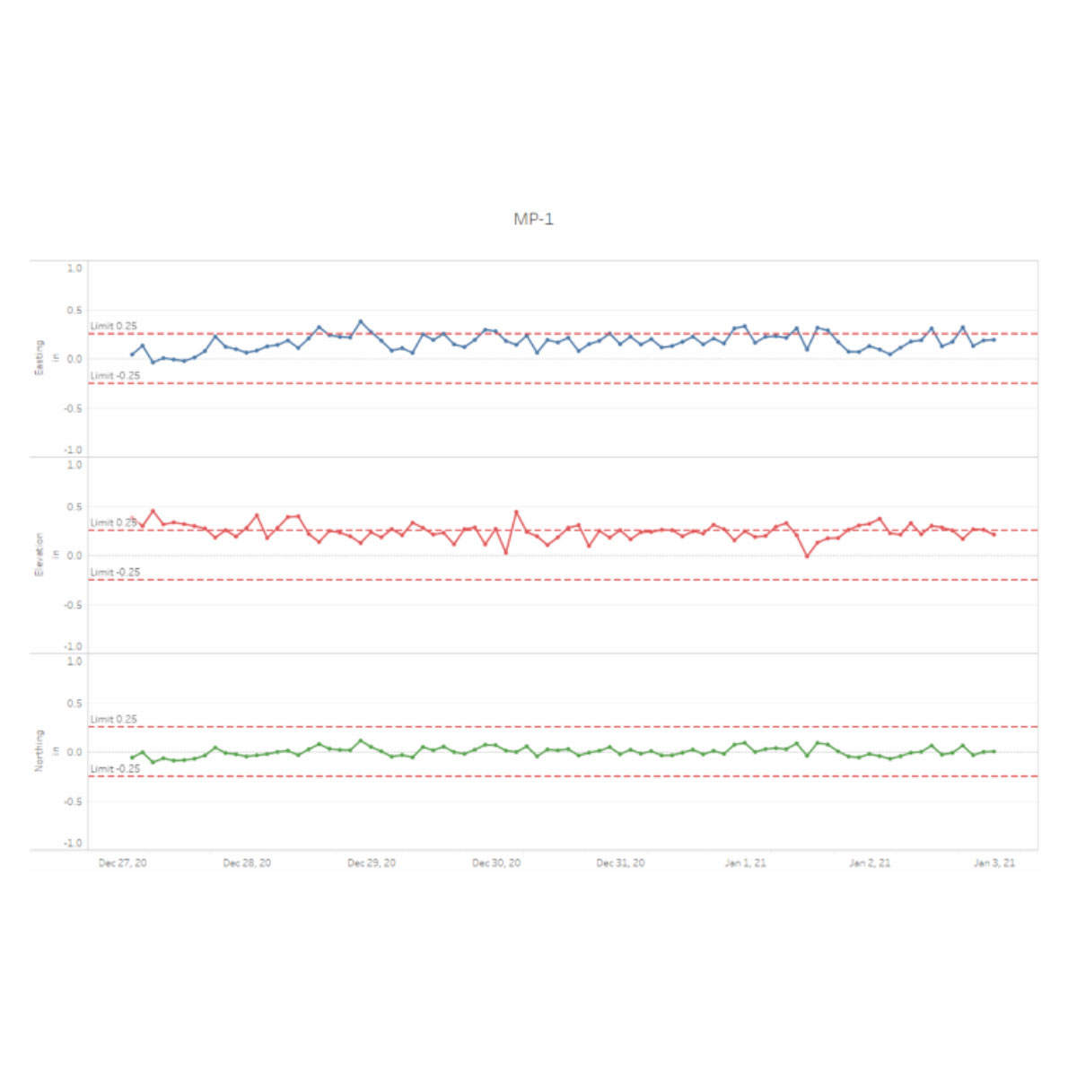
Animation
Interactive animation is an excellent way to visualize the relative changes of multiple parameters vs. time, for example:
- Readings from biaxial tiltmeter:
- Tilt in the A-axis vs. tilt in the B-axis over time
- Tilts in the A and B-axes vs. temperature over time
- Readings from an optical prism read with Automated Motorized Total Station (AMTS, aka Robotic Total Station)
- Northing deflection vs. Easting deflection over time
Reports
Using Tableau’s feature-rich functions, it is easy to create a printable report of the data in eagle.io. The report will include a collection of charts, maps and tables as described above as well as a custom cover page, and pages containing graphics and free flowing texts. The finished report can be converted to PDF with up-to-date data, and distributed via email, to a list of recipients daily, weekly or monthly.
Sample ReportUseful Videos/Links